
In typography and graphic design, tracking is the adjustment of horizontal space between letters in a word or line. Tracking is one of the most important aspects to consider when working with typography. Tracking can be used to improve the overall appearance of text, making it more legible and aesthetically pleasing.
Tracking can be adjusted manually or through automated methods, such as kerning pairs and tracking rules. In this guide, we will explore what tracking is, how it is used in typography and graphic design, and some tips for getting the most out of this essential typography technique.
Disclaimer: This post may contain affiliate links. This means I may receive a commission at no extra cost to you. I only suggest products I use and love.
How to Define Tracking in Typography
Tracking is the adjustment of space between letters in a word or line. Tracking is sometimes thought of as letter spacing and how you can increase or decrease the space between letters, improving the overall appearance of text.
You can increase or decrease the tracking of text in your design to create the desired effect whether that be creating a lighter and airy feel by increasing the tracking or creating a squished, tighter block of text by decreasing the tracking.
In contrast to kerning, which refers to the adjustment of space between individual characters, tracking adjusts the space evenly throughout a block of text. Kerning and tracking are used together in typography to create a visually balanced and pleasing appearance of a word or an entire block of text.
How is Tracking Used in Typography and Graphic Design?
In graphic design, tracking can be used to make text stand out or blend into the background of a design depending on how heavy of a presence you want to give your text. Tracking can also be used to improve readability, especially in tight or cramped layouts where adjusting the tracking may give the text more breathing room.
In typography, tracking is often used to create a specific visual aesthetic or tone for a design. For example, increasing the tracking can give a light and airy feel while decreasing the tracking may add tension and impact to the text.
Tracking can also be used in branding to ensure consistency throughout various design materials. By setting specific tracking values for brand fonts, designers can ensure that all text and logos appear uniform across different mediums. Using tracking values and rules for branding is a very important aspect of typography that many people may not even think of as being a possibility!
Tracking Definition Typography
Tracking is a fundamental aspect of typography, and it can have a significant impact on the overall appearance and legibility of text. In general, small adjustments to tracking can enhance readability by creating visual balance in a block of text. However, excessive adjustments to tracking can negatively affect legibility and make text difficult to read.
What is tracking in typography?
Professionals use tracking to create visual balance in a block of text. Adjusting the tracking can help improve legibility and enhance the overall appearance of the typography. Tracking is also used to change the overall texture or look of a block of text, such as creating a tighter or looser texture. Tracking is an essential tool in typography that can be used to create a desired effect in a design.
Letter Tracking in Typography
Tracking in typography refers to the adjustment of space between letters in a word or line. Letter tracking can be adjusted manually or through automated methods, such as kerning pairs and tracking rules. Adjusting the tracking can enhance the appearance and legibility of text in a design and add a certain type of style to your design.
How to Change Typography Tracking
You can change the tracking of a word or a phrase within the design program you’re using by selecting the text and adjusting the tracking value in the character or type options.
You can adjust the tracking manually in addition to adjusting the spacing between each letter, known as kerning. You can change a text’s tracking in most design software including Adobe Illustrator, Adobe InDesign, Adobe Photoshop, and Canva.
How to Change Tracking in Adobe InDesign and Adobe Illustrator
In Adobe InDesign and Adobe Illustrator, you can change the tracking by selecting the text and adjusting the value in the Character window.
You can find the Character window by selecting “Window” and then “Type” and then choosing “Character.” or Type options. The tracking tool looks like the letters VA next to each other with a double-sided arrow underneath.
How to Change Tracking in Canva
In Canva, you can change the tracking by selecting the text and clicking on “spacing” in the top toolbar. The spacing tool looks like 3 parallel lines with a double-sided arrow pointing both upward and downward.
You’ll see options to change either the letter spacing or the line spacing. In Canva, changing the “letter spacing” is equivalent to changing the tracking in Adobe software.
Tracking Typography Example
One example of tracking in typography is adjusting the space between letters in a word or line to create visual balance. A block of text with evenly spaced letters can appear visually balanced, while uneven letter spacing can create an unbalanced and cluttered look. Adjusting the tracking can also change the overall texture or feel of the typography, such as creating a tighter or looser cluster of letters.
Another example of tracking is using it to create a specific style in a design. Increasing the tracking can create a bold and impactful look while decreasing the tracking can create a tight and condensed appearance. In contrast, excessive adjustments to tracking can negatively affect legibility and make text difficult to read.
If you are making drastic changes to the tracking in your design, it is important to consider the font being used and how it may be affected by the adjustments. As with any aspect of typography, it is crucial to consider legibility and overall appearance when adjusting the tracking in your design.
Examples of Bad Tracking in Typography
There are a few ways that tracking can be used in a negative way in graphic design. Here are a few examples of bad tracking in typography that you want to avoid:
- Using excessive adjustments to the tracking, leading to illegible and cluttered text
- Not considering the specific font being used and how it may be affected by changes in tracking
- Excessive or uneven adjustments to the tracking make the text unbalanced and difficult to read
- Not adjusting the tracking at all, resulting in cramped or scattered letter spacing
Examples of good tracking in typography
On the other hand, here are a few examples of good tracking in typography that can enhance the overall appearance and legibility of text:
- Making small adjustments to create a visually balanced and evenly spaced block of text
- Using the tracking to create a desired style or texture in the typography
- Considering the specific font and how tracking affects the font style
- Adjusting the tracking to create visually balanced and legible text
- Using a combination of kerning and tracking to improve the appearance and readability of specific letter pairs
How do professionals use tracking in typography?
Professionals use tracking to create visual balance and enhance the appearance of text in a design. Adjusting the tracking can also change the overall texture or feel of the typography, such as creating a tighter or looser design. A graphic designer will rarely finalize a design without first adjusting the tracking of the text to make sure it is just right and visually appealing.
How does typography measure tracking?
Tracking is measured in a unit called “ems.” One em is equal to the width of the letter “M” in the chosen typeface. In graphic design or typographic software, a designer can increase or decrease the tracking by increments of 0.1 ems for precise adjustments.
The measurement of tracking is usually done in increments, such as 1/10th or 1/100th of an em (a unit of measure equal to the width of the letter “M”). Tracking is typically measured in positive and negative increments, making adjustments to the tracking.
For example, a tracking value of 50 would mean that the space between each letter is half the width of the letter “M”, while a tracking value of -50 would mean that the space between each letter is compressed by half the width of the letter “M.”
Examples of bad tracking in typography might be when the letters are too tightly spaced or too widely spaced, making it difficult for readers to discern individual letters or words. On the other hand, good tracking in typography would be when the spacing between letters is visually balanced and enhances readability.
Tips for Tracking in Graphic Design
- Experiment with Tracking in Design
- Tracking is Font-Dependent
- Use Tracking, Kerning, and Leading Together
- Get a Second Opinion
Experiment with Tracking to Find the Right Balance for Your Design
It is imperative to experiment with tracking if you are adding text to your design. Different fonts and font sizes require different amounts of tracking, so it is important to adjust accordingly. Focusing on experimenting with tracking in all of your designs will help you hone your typography skills as a graphic designer and will lead to more visually appealing and balanced designs.
Consider the Differences in Shape and Spacing Between Fonts
Not all fonts are created equal and some may require more or less tracking for a balanced design. It is important to consider the specific characteristics of each font before adjusting the tracking. If the font you are working with has ligatures and swashes, for instance, you may need to adjust the tracking to accommodate these elements.
Use Different Tracking for Different Fonts to Maintain Visual Balance in Your Design
It is important to use different tracking for each font in your design to maintain visual balance. This means adjusting the tracking for each individual font rather than using the same tracking across all fonts in your design. This is necessary in order to create a balanced and cohesive design.
Combine Tracking with Kerning and Leading for a Polished Look
Kerning and leading play important roles in typography as well, and it is important to consider all three elements when creating a design with text. Adjusting only one element may throw off the balance of the design, so be sure to make changes to tracking, kerning, and leading simultaneously for a polished look.
Ask for a Second Opinion from a Fellow Designer
Getting a second opinion from someone with fresh eyes can also help you determine if the tracking in your design looks balanced or if it needs further adjustment. Plus, getting feedback from both a fellow designer and non-designer can give you different perspectives on the overall look of your design.
Overall, tracking is a valuable tool for enhancing the appearance and readability of text in typography and graphic design. Experiment with different adjustments to find the right balance for your designs, and consider the differences between fonts when adjusting the tracking.
Tracking vs Kerning in Typography
Kerning refers to the adjustment of space between specific letter pairs, while tracking refers to the adjustment of space between all letters in a word or line. In addition to adjusting the tracking, professionals also use techniques such as kerning and leading to fine-tune the appearance of text in a design.
Both kerning and tracking can be used to enhance the readability and overall appearance of typography, but it is important for graphic designers to know the difference between the two techniques.
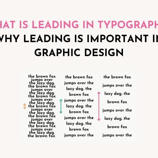
Tracking vs Leading in Typography
Leading refers to the adjustment of space between lines of text and is also known as line spacing. It can be used to improve readability and create visual balance in a block of text, but it should not be confused with tracking, which adjusts the space between letters.
Leading is useful for adjusting the overall appearance and readability of a block of text, especially if a text has long ascenders and descenders or elaborate swashes that interfere with the line of text above or below it.
Why is tracking important in typography?
Tracking is an important technique that graphic designers can hone their skills with. Tracking creates a significant impact on the overall appearance and legibility of text in typography. Adjusting the tracking can create visual balance, enhance readability, and change the texture or feel of the typography.
If you have not played with tracking in your designs before, modifying tracking is a surefire way to take your graphic design career to the next level. With each new skill you learn, the better your portfolio gets!
What’s the difference between tracking and spacing?
The terms “tracking” and “spacing” are often used interchangeably, but they technically refer to different typography adjustments. Tracking refers to the adjustment of space between all letters in a word or line, while spacing (also known as letter spacing) refers to the adjustment of space between individual letters.
Is letter spacing the same thing as tracking?
No, letter spacing and tracking are not the same. Letter spacing refers to the adjustment of space between individual letters, while tracking refers to the adjustment of space between all letters in a word or line.
What is tracking in a paragraph?
In a paragraph, tracking refers to the adjustment of space between all letters in a line or block of text. This can impact the overall appearance and legibility of the paragraph. Designers will use tracking in a paragraph to enhance the visual balance and readability of the text.
Overall, tracking is an important tool for enhancing the appearance and readability of text in typography. By adjusting tracking, you can create visual balance, enhance readability, and change the texture or feel of the typography. When using tracking in your designs, be sure to experiment with different adjustments to find the right balance for your project. Don’t forget to save this article full of typography tracking tips for you to come back to!
Do you have any questions about tracking in typography? Ask your questions in the comments below! Happy designing!

Free Resources:
- 60 Best Canva Script Fonts
- 45 Best Canva Font Pairings Template
- 25 Best Free Canva Fonts List Canva Template
- Free Stripe Pattern Procreate Brushes
Related Posts:
- What Is a Script Font? Different Styles of Script Fonts and How to Use Them
- 25 Best Free Fonts in Canva [in 2022] A Guide for Designers
- 60 Best Canva Script and Cursive Fonts: Handwriting, Script & Cursive Fonts in Canva
- Top Graphic Design Trends in 2023: What’s Coming in 2023 + Expert Tips
- 45 Best Canva Font Pairings and Combinations for Eye-Catching Designs: A Guide for Designers [2022]
- How to Upload Fonts to Canva: Step by Step Tutorial [VIDEO]
Leave a Reply